The Perfect Pair: Why Red and Green Are the Quintessential Christmas Colours

The festive season is synonymous with a vibrant colour palette, but none more iconic than the pairing of red and green. This dynamic duo has become an integral part of Christmas celebrations worldwide, captivating our senses and evoking a sense of wonder and joy.


4 minute read

10th December, 2024 | Remarcable

The festive season is synonymous with a vibrant colour palette, but none more iconic than the pairing of red and green. This dynamic duo has become an integral part of Christmas celebrations worldwide, captivating our senses and evoking a sense of wonder and joy. 


In the early 20th century, Coca-Cola played a significant role in popularising the image of Santa Claus as a jolly, red-suited figure. This iconic image further solidified the association between red and green with Christmas.


But why these particular colours? Let's delve into the fascinating history, colour psychology, and science behind this timeless combination.


Historical Roots

The origins of red and green as Christmas colours are deeply rooted in ancient traditions and Christian symbolism. Evergreens, such as holly and ivy, were revered by Celtic cultures for their ability to thrive during the winter months. These hardy plants symbolised eternal life and were often used in winter solstice celebrations. The bright red berries of the holly were associated with the lifeblood of nature, representing vitality and resilience.


Psychological Impact

Beyond their historical significance, the pairing of red and green has a profound psychological impact.


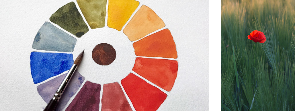
  • Complementary Colours: Red and green are complementary colours, meaning they sit opposite each other on the colour wheel. This contrast creates a visually stimulating and striking effect that is pleasing to the eye. Studies have shown that complementary colours can enhance visual acuity and attention span. Additionally, they can create a sense of depth and dynamism in a design, making it more engaging.


  • Emotional Response: Red is a powerful colour that can evoke strong emotions, such as excitement, passion, and energy. Green, on the other hand, is often associated with nature, peace, and tranquillity. Together, they create a balanced and festive atmosphere that can evoke feelings of joy and celebration. Red's stimulating nature can heighten excitement and anticipation, while green's calming influence can balance this energy, leading to a sense of overall harmony and contentment. This harmonious blend of emotions contributes to the festive spirit and joy associated with Christmas.


  • Nostalgia and Comfort: The combination of red and green is deeply ingrained in our cultural memory, particularly in Western cultures. It evokes feelings of nostalgia, warmth, and comfort, reminding us of cherished holiday traditions and childhood memories.  This strong cultural association creates a sense of familiarity and security, making the colour combination particularly comforting during the festive season. 


The Science Behind the Perfect Pair

While there isn't a specific scientific theory explaining why red and green are the perfect Christmas colour combinations, we can explore the physiological effects of these colours to understand their appeal.


  • Colour Perception: Our eyes perceive colours through specialised cells called cones. Red and green lights stimulate different types of cones, and the contrast between these colours can create a strong visual impact. This contrast can enhance visual acuity and attention span, making the combination of red and green particularly appealing to the eye.


  • Brain Response: The brain processes colour information and associates it with specific emotions and memories. The combination of red and green can trigger a complex neural response, leading to feelings of happiness, excitement, and contentment. Studies have shown that certain colours, including red and green, can influence brain activity and emotional responses. For example, red can increase heart rate and blood pressure, while green can have a calming effect.


Leveraging Colour Psychology in Healthcare and Commercial Spaces

The impact of colour psychology extends beyond the festive season. 

The strategic use of colour can significantly impact the atmosphere and productivity of healthcare and commercial spaces. In healthcare settings, soft shades of green can create a calming and soothing ambience, reducing patient anxiety and stress. Consider incorporating green accents into waiting rooms, patient rooms, and common areas to promote relaxation and well-being. For staff areas, the strategic use of bold pops of red can energise and invigorate, enhancing productivity and morale. However, it's crucial to use red sparingly to avoid overwhelming patients.

In commercial spaces, colour psychology can be leveraged to drive sales and enhance customer experiences. Warm shades of red can evoke feelings of excitement and urgency, encouraging impulsive purchases. Consider using red accents on display shelves or in promotional materials to stimulate consumer interest. For office spaces, incorporating green elements, such as plants, artwork, or furniture, can promote focus, concentration, and overall productivity. By understanding the psychological impact of colour, businesses can create environments that not only look great but also optimise performance and satisfaction.


Remarcable Design: A Modern Twist

Today, interior designers and artists continue to harness the power of red and green to create stunning and festive spaces. From minimalist interiors adorned with a single, bold red accent to maximalist designs featuring a riot of holiday hues, the possibilities are endless. Here are some of the ways we would incorporate these colours into designs for healthcare and commercial space owners:

  • Minimalist Elegance: A simple arrangement of red and green preserved flowers in a sleek vase can add a touch of festive cheer to any room.


  • Bold and Vibrant: A large, abstract painting featuring artistic strokes of red and green can be a striking focal point in a contemporary space.


  • Cozy and Inviting: A collection of red and green throw pillows can instantly transform a sofa or armchair into a comfortable holiday haven.


In conclusion, the enduring appeal of red and green lies in their ability to evoke a wide range of emotions and memories. From ancient traditions to modern marketing, these colours continue to captivate us and add a touch of magic to the Festive season. As we gather with loved ones to celebrate the holidays, let us appreciate the beauty and power of this timeless colour combination.

Good Reads

Design

3 Tailored Design Solutions that Make Your Workspace Stand Out

The way we work is changing, particularly in today's competitive landscape. Gone are the days of cookie-cutter spaces. First impressions now matter more than ever, and your workspace is no exception, extending far beyond the handshake. Your interior choices are a powerful tool, silently shaping client interactions, employee morale, and your overall brand identity.

Design

Pros and Cons of Working with an Interior Design Company

In today's competitive landscape, strong interior design is no longer a luxury - it's a necessity. This is because a well-designed space can be the difference between success and failure. But for many businesses, the in-house resources to create exceptional designs are not there. That's where interior design companies come in.

Design

Wellness, Harmony, Personality: Design Trends 2024

Forget the rigidity of minimalism and the din of maximalism. 2024 whispers a softer, bolder design language. Imagine spaces that embrace your unique rhythm, sparking joy, soothing your soul, and celebrating meaningful style.

Design

Five ways to cultivate sustainability this holiday season

Like our designs that are rooted in nature and wellbeing as well as economic principles that make sure our clients increase their bottom line, we believe it's important to be both practical and healthy. We know... it's much easier said than done. Here's how we suggest you can blend both over the festivities this holiday season, in ways that are far from unattainable.

Design

Engaging Dentistry Design like you've never seen before: the Craft behind the Magic

The question on the table was ‘How can we help showcase dental aligners in a way that makes them approachable, yet remain on-brand with Banning’s practice quality and interiors?’ As the top Interior Architecture and Design firm in London for Healthcare Spaces that are strategically crafted to outperform the competition, we were excited to answer it with a one-of-a-kind art installation that we can now share.

Design

A Tenancy Maintenance Guide: Your 3 Keys to Keeping Your Business Running Smoothly

We understand the excitement (and stress) of running a successful business, and all the risks that come with it. To say that maintaining a business can feel like a constant juggling act would be an understatement; managing customers, boosting your marketing, retaining your staff, and chasing ambitious goals are all in the mix, and usually at the same time. Here's the keys to keeping it all together...

Design

New Tenancy Holders; jot down these considerations now or beware the costs

With years of experience in the field, experiencing the best and most ideal of spaces, as well as the ones we are disappointed to see go so poorly, our team is happy to share the know-how you need to help protect your wallets, fuel your progression, and most importantly, help you take your vision forward with as little hiccups as possible.

Design

Colour Palettes for Increased Performance and Wellbeing: 2023 Design Trends You Can't Miss

As people seem to long for a return to a more natural, human-centric way of life with a sense of community and unity, we believe as leaders we must increase our awareness of self, others, and our environment to come together in unity and find a balance. As design has a great impact on our emotions and well-being, utilising impactful design elements like colour can help us achieve this.

Design

Strategising Wellbeing in Workplace Design

‘This January felt different, the motivation is not there; work and wellbeing is falling behind.’ This feedback got us thinking… has the workforce ignored wellbeing for too long? Begin strategising with these pinpointed key areas that can be approached individually or combined in a plan to help boost wellbeing in your workspace.

Design

Fortes Case Study

Bespoke is our signature styling, in this recent case study for Fortes Hair & Skin Clinic we break down the importance of bespoke elements and how they can be utilised as brand messaging and unique selling points.

Design

Colour Psychology - Think Pink!

Having a deeper understanding of the colour psychology behind the colour pink and how it can best be used in commercial and healthcare interior design.

Design

Homework Space Case Study

Understanding the process of designing a successful co-working space, what to consider and what design elements are a must to capture the brand identity, message and concept.

Design

Circadian Rhythm in Design

Understanding what our internal circadian rhythm is and how it affects our wellbeing to know how we can incorporate circadian health within commercial interior design to maintain optimal levels of productivity.

Design

2D vs 3D Space Planning

Space plans are a fundamental element of any interior design process; they have great advantages in providing an accurate visualisation of the exact dimensions of the intended physical design of a space. Floor Plans can be made on both 2D and 3D bases providing different results which has been broken down in simple format for your understanding.

Design

The Importance of Detail throughout Design

Expanding far beyond aesthetics, we at Remarcable mean a method of expression that communicates a story through strategy carefully tailored to magnify the micro details and fully optimize their attributes’ capacity at creating a long-lasting impression in a single short interaction and it is all in the details.

Design

Co-working, Hybrid Model, WFH what is best for my company? pros and cons

With so many work models out there it can be hard to decide which one works best for your company as there is no ‘one size, fits all’ when it comes to office space to match your company values, size, and growth. We have broken down the pros and cons to co-working space models to help you best decide.

Design

How to put patients at ease and add value to your private clinic

There is a lot of fear at the moment around our health due to the pandemic and people are avoiding booking their dentist checkups. We share with you some ways you can ensure the safety of your clinic and reassure your patient's safety to return back to their overdue appointments.

Design

How can your space design set you apart from your competitors?

Commercial interior design is changing, we are in an age where technology and design innovations are booming and our environments need to keep up with the trends. We have filtered together three main factors in design that will set your company apart from its competitors; because first impressions are lasting impressions.

Design

Guide to maintaining a good work environment

With over 20 years of experience in office fit outs and maintenance we have listed 6 quick and easy tips for you to consider in maintaining your office environment and equipment.

Design

How to make meetings more bearable

Reimagining the idea of attending and entering a meeting room through our 4 main focus areas in designing strategic office spaces that benefits our wellbeing.

Design

Remarcable’s Artsy Take On Dentistry

An in depth view of our thoughts and processes for designing a commissioned project centred around wellbeing and innovation within dentistry design.

Design

Work Rest Replenish Perform

The importance of break out areas in the workplace and how to best design these to meet our human needs of connecting with nature.