Homework Space Case Study
Understanding the process of designing a successful co-working space, what to consider and what design elements are a must to capture the brand identity, message and concept.
4 minute read
25th November, 2021 | Remarcable
The design process for this co-working space project was to first understand two major factors that would determine the theme of the overall design. First was understanding the ins and outs of our client's brand and secondly incorporating from our own experience in commercial interior design what a 'successful office space' looks and feels like, what are the must-haves, and how can the space be versatile to appeal and fulfil the needs of a large audience.

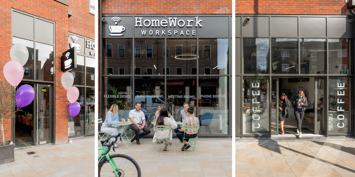
Homework Space Southfields is an extension of Homework Space Putney with a brand vision in combining coffee culture with a 'home away from home' office space feel with all the necessary facilities to work well, efficiently, and productively. They have a strong community culture and supporting local businesses is a big part of their company's values; from supplying local speciality coffee and tea brands to collaborating with local artists. Due to their local networking, a big part of the design around this co-working space was also to be able to accommodate networking events for the community.

Backed with 10+ years of experience in commercial interior design we established what makes a healthy work environment supporting work life balance for increasing employee wellbeing & productivity that offer 4 key elements: Work, Rest, Collaborate, Replenish. Our design thinking for this co-working space included the combination of defined areas that we know an office with a big team needs to individually satisfy everyone's needs and working styles.


The real design is in the details. Design details enable us to spread the awareness of the brand message, it is what unifies a space to a company's values and culture. Understanding that a large part of Homework Space company's values are around coffee culture and supporting local businesses to be a part of the greater community, it was necessary to highlight these aspects through design detailing.

In the cafe area, bespoke graphics were created of herbal plants and coffee beans that are in correlation to the variety of tea and coffee they offer. Art from local artists was contributed in the space as well which shows the company's values in supporting small local family-run businesses like their own. By creating bespoke coffee bean artwork that incorporated a humorous element for the purpose of 'instagrammable' art which encourages the chance of free marketing and also shines a focus on the company's overall value and theme around worldly coffee culture.
Brand Colours:
To be able to unify a space to be on-brand, it is necessary to incorporate the brand's colours throughout. To achieve this for our client we soften their company's brand colours slightly to incorporate more earthy tones which complemented the building's quirky architecture as well as the chosen art pieces. Each art piece was nature-inspired, the idea behind this is to take people on a journey to stimulate their senses in reminding them of travel and what that feels like. The scale of the art pieces also played a part in creating the illusion that you are looking out of a window into those scenes, evoking emotions around how you feel when travelling, the inspiration that comes with it and the motivation that is required to achieve it. When choosing colours and art for a space all factors are considered to be in line with the brand message and more importantly how you want people to feel when they enter your space.
Extra: When choosing colours for your brand that will be reflected in design it's important to consider colour psychology. Download our free colour guide for more information and meaning behind colours to evoke the right look and feel for your brand.
Biophilic design is one of our key elements because of its intense proven research to reduce stress, improve cognitive function and creativity and increase our overall well being. In order to create a connection between the downstairs and upstairs spaces the use of planters with hanging plants broke away the illusion of divide and instead created cohesion. Throughout the design a key focus was to continue to tie together the unique elements of the building's structural features with potted plants. This combination of exposed brick and greenery adds an overall casual and warm vibe that is apparent in coffee/cafe culture and recreates that same atmosphere within a working environment.
Logistics:
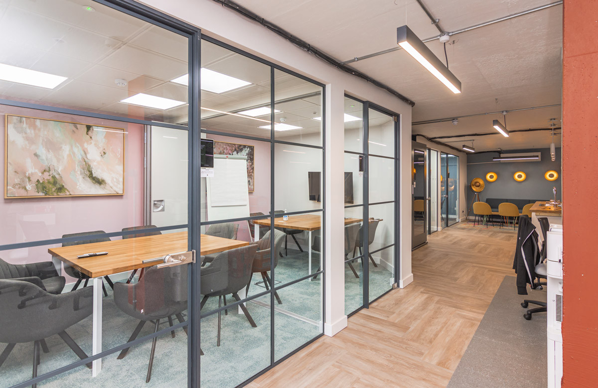
For such a large open plan space to create defined areas is always a bit of a challenge. The best way to define specific areas is by breaking up the floor space. Having different textures from carpet in the workspaces to tiles in break out areas and consistently having vinyl flooring in corridors. This unconsciously creates separation in the human psyche and allows each space to feel defined for its specific purpose.
One of the number one distractions in offices is noise disruption. From a logistic perspective, it is necessary to insert noise isolation panels throughout the space and in between every internal wall. This helps to cancel out noise disruption from other users in the space.
Basement spaces always feel slightly more constrained and lack the natural lighting from windows. Therefore it is always recommended to choose optimum lighting that mimics natural light, as well as creating a subliminal illusion of windows by choosing meeting room slide doors that replicate the design of window frames.


