Project explanation
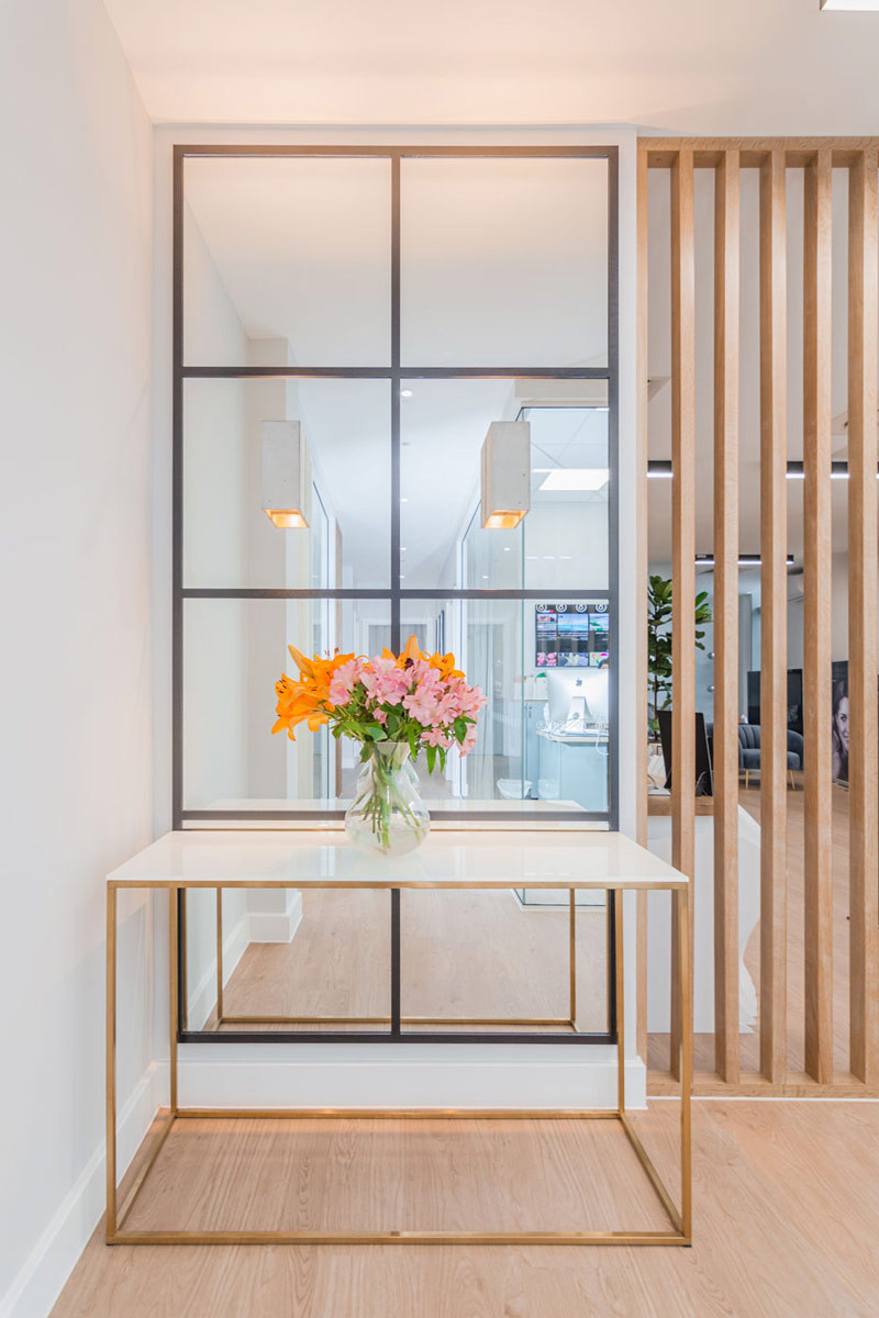
The company’s main hub is to be consistent in design uniformity with their other branches inspired by Scandinavian minimalism and natural materials with an additional element incorporating a space where staff training can take place.
Each building has its own unique quirkiness which is considered in the overall design to make minimal changes to the structure as possible, reducing time and costs. Glass partitions and designing an open and airy atmosphere ensured that the building's natural light was emphasised throughout the space; natural light benefits our wellbeing and improves our circadian rhythm. Keeping the same textures and materials as the company’s other branches was important in keeping the uniformity and branding consistent whilst adapting to new surroundings and bringing in our expertise in meeting room design to create a staff training room focusing on collaborative space and function.
Knowing our client's future plans around possible expansion, the design considered the location of the building's fittings in a way that would be of ease later down the line for additional surgical rooms, saving both cost and time for the client. One great benefit of planning shell and core fit outs in combination with design is that everything can be pre-planned to be fully bespoke. In addition, furniture was positioned specifically to minimise the radiation protection within the room; this quick solution saved cost on fit out and construction.


